Visualising RAG data#
The example code below assumes you already have your documents loaded into the bionicGPT database.
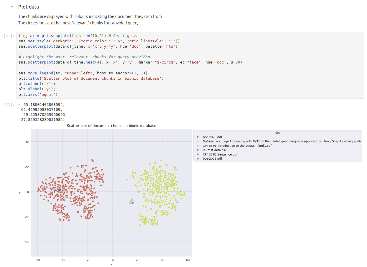
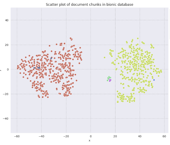
We will create a scatter graph showing the document chunks of data together with the 4 most ‘relevant’ chunks based on the query you specified.
At the end we should have a diagram like this
Setup and Retrieve Query Embeddings#
pip install -q sqlalchemy psycopg2-binary pandas
pip install -q matplotlib seaborn scikit-learn
import sqlalchemy
import pandas as pd
import requests
from sqlalchemy import text
import json
import numpy as np
from sklearn.manifold import TSNE
from sklearn.cluster import KMeans
import seaborn as sns
import matplotlib.pyplot as plt
url = "http://embeddings-api:80/embed"

data = {"inputs": "how much money did the bank of england hold at end of 2022?"}
headers = {"Content-Type": "application/json"}

response = requests.post(url, json=data, headers=headers)
engine = sqlalchemy.create_engine('postgresql://postgres:testpassword@postgres:5432/bionic-gpt')
conn = engine.connect()
Retrieve Document Data from Database#
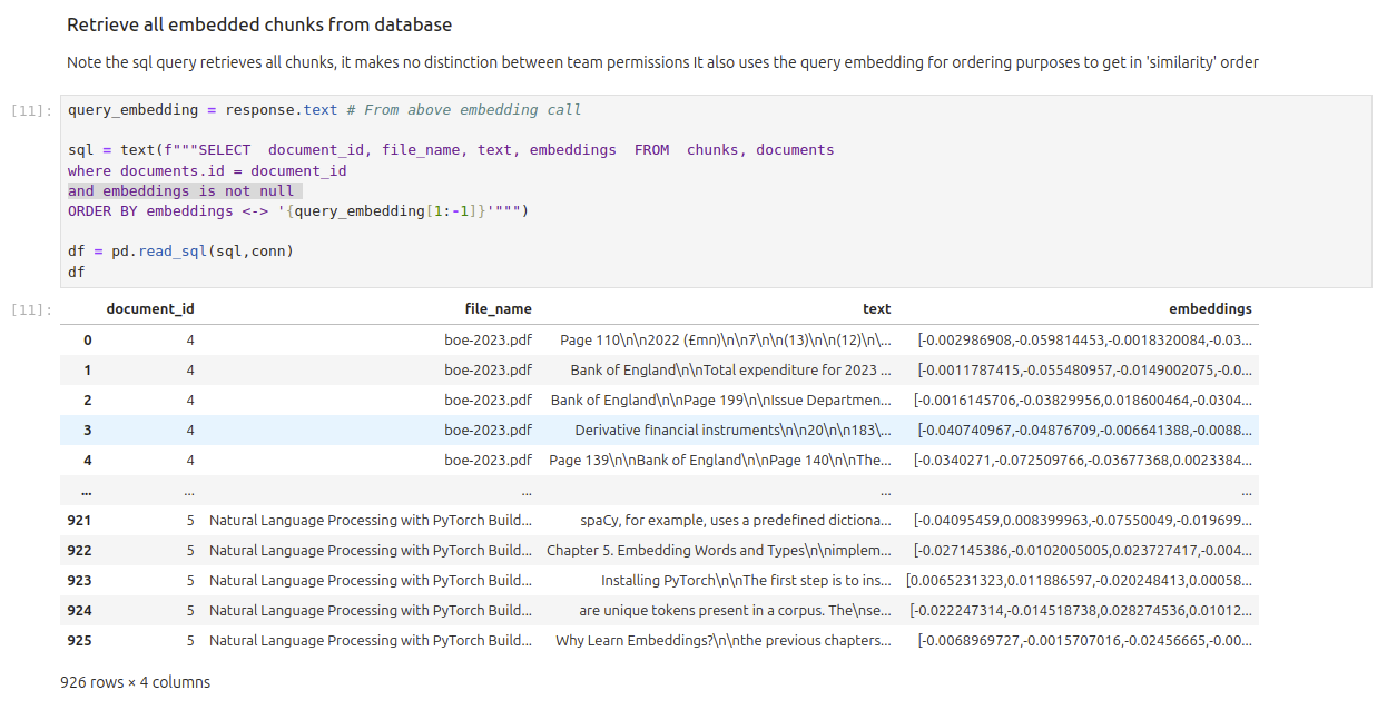
We will now use the query embeddings from above to retrieve all document chunks from the data ordered by ‘similarity’
query_embedding = response.text # From above embedding call

sql = text(f"""SELECT  document_id, file_name, text, embeddings  FROM  chunks, documents
where documents.id = document_id
and embeddings is not null
ORDER BY embeddings <-> '{query_embedding[1:-1]}'""")

df = pd.read_sql(sql,conn)
df
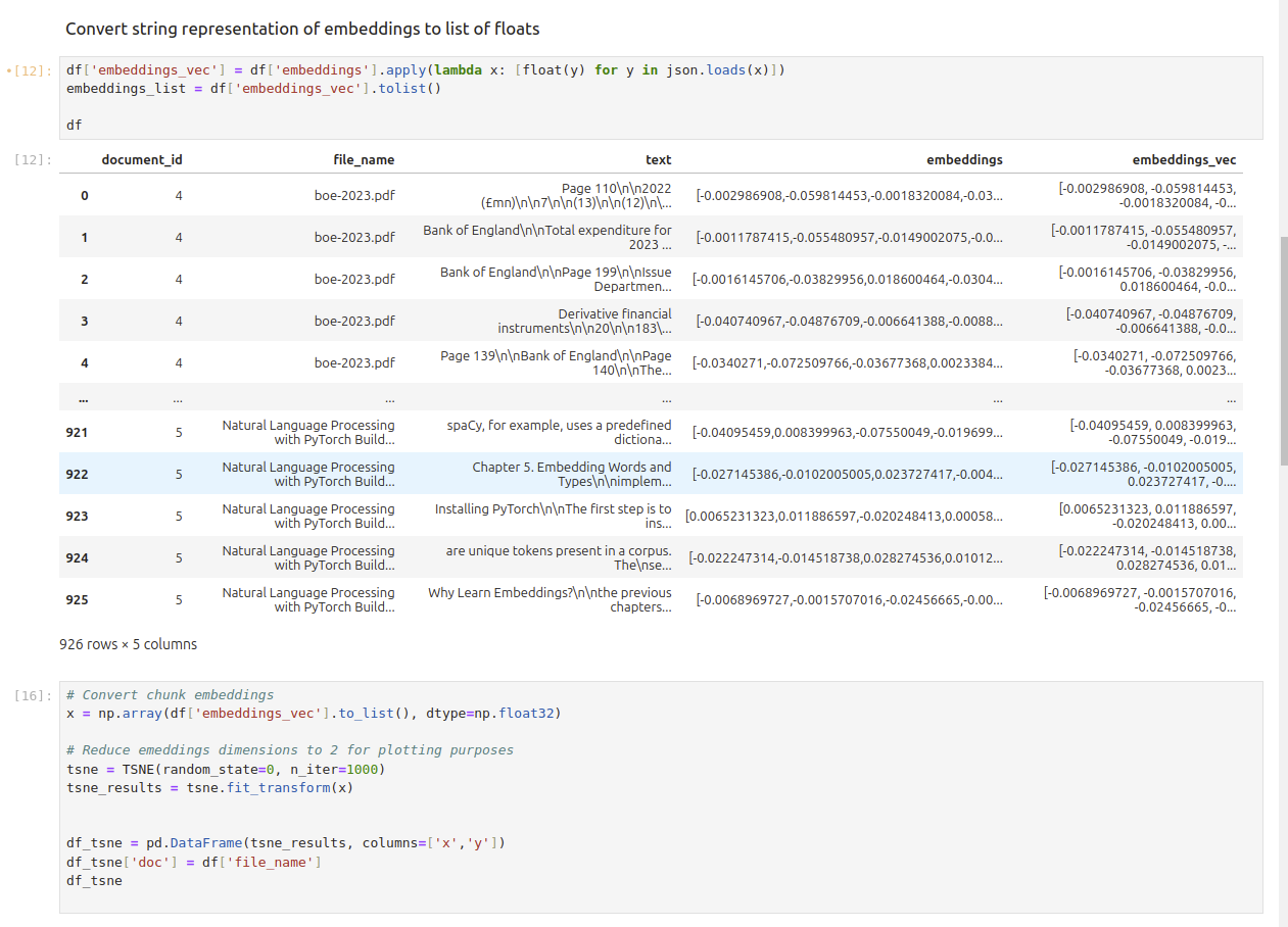
Convert Data Retrieved into 2 Dimensional Data#
df['embeddings_vec'] = df['embeddings'].apply(lambda x: [float(y) for y in json.loads(x)])
embeddings_list = df['embeddings_vec'].tolist()

df
# Convert chunk embeddings
x = np.array(df['embeddings_vec'].to_list(), dtype=np.float32)

# Reduce emeddings dimensions to 2 for plotting purposes
tsne = TSNE(random_state=0, n_iter=1000)
tsne_results = tsne.fit_transform(x)


df_tsne = pd.DataFrame(tsne_results, columns=['x','y'])
df_tsne['doc'] = df['file_name']
df_tsne
Plot Results#
Different colours refer to the different documents uploaded. The 4 circles in blue highlight the 4 most ‘relevant’ chunks based on the query used above.
fig, ax = plt.subplots(figsize=(10,8)) # Set figsize
sns.set_style('darkgrid', {"grid.color": ".6", "grid.linestyle": ":"})
sns.scatterplot(data=df_tsne, x='x', y='y', hue='doc', palette='hls')

# Highlight the most 'relevant' chunks for query provided
sns.scatterplot(data=df_tsne.head(4), x='x', y='y', marker="$\circ$", ec="face", hue='doc', s=30)

sns.move_legend(ax, "upper left", bbox_to_anchor=(1, 1))
plt.title('Scatter plot of document chunks in bionic database');
plt.xlabel('x');
plt.ylabel('y');
plt.axis('equal')